Musings #5
Finding Simplicity in a World of Overdesign
Much of the modern internet is a mélange of clunky websites, ads, paywalls, cookie warnings, CAPTCHA’s, 17-step logins, endless passwords, annoying javascript popups, more ads, ad blockers to block ads, and complexity to the point of sensory overload.
I don’t say that to be pessimistic. In fact, I’m optimistic about the way userflows and modern design aesthetics are trending towards more simplicity. Substack, for example, is built with simplicity in mind. Notion is a delight to use. Matter is a slick reader for newsletters and articles. Canva and Beautiful.ai produce beautiful presentations and content. Most DTC and enterprise SaaS websites are wonderfully optimized and simple, albeit without any originality at this point. And Web3 promises a much better future that I’m excited about.
But in the meantime, today’s internet is a lot of this:
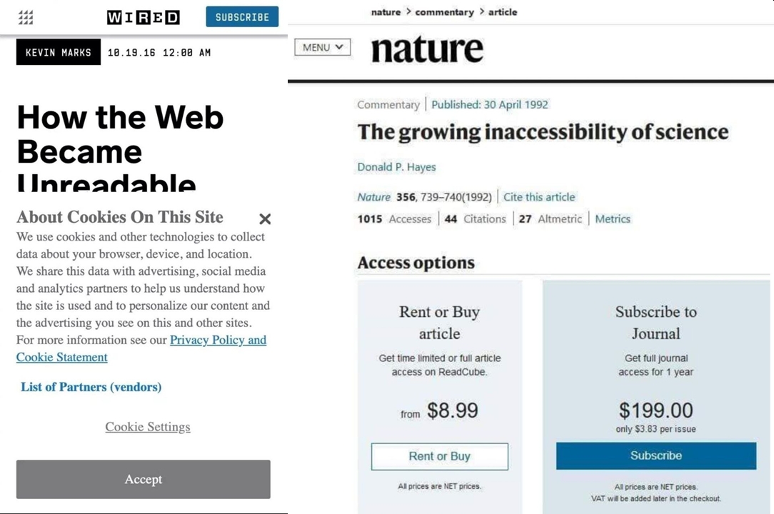
Source: Twitter (original tweet link broken - figures...)
Or this:
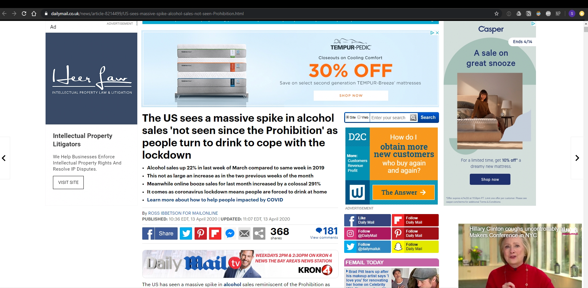
80% of this screen is ads.
These examples are obvious. But here’s one aspect that wasn’t to me:
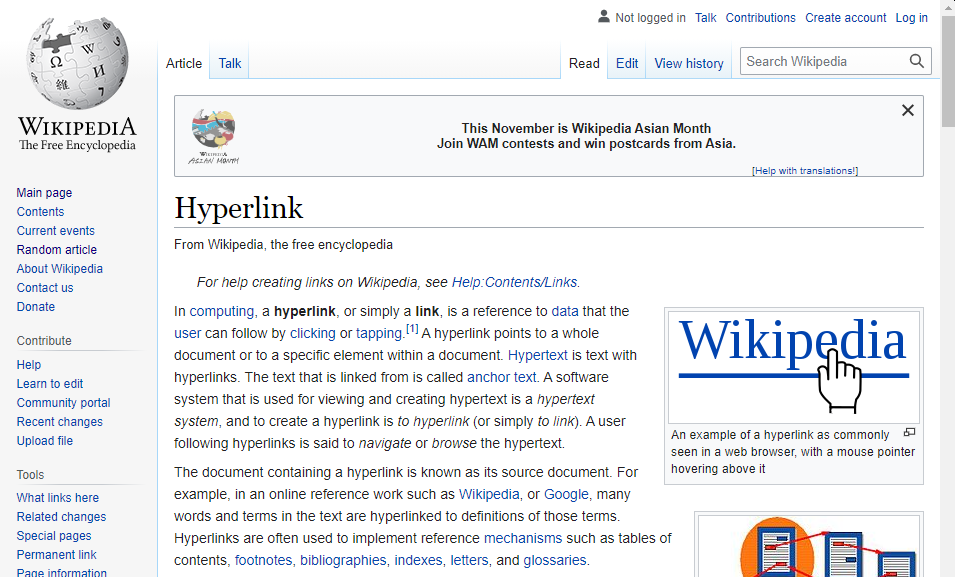
Wikipedia has been around for so long and offers instant knowledge relatively efficiently so it seems fine. But arguably its design is actually not that readable:
The thing that perhaps sticks out the most is the sheer number of hyperlinks. The modern wikipedia article has nearly 30 of them within the first paragraphs of text, and it’s further surrounded by a cloud of links to the margins.
When reading the text, we must make a decision when arriving at each link what to make of it. Should we click it? No, continue. Should we click it? No, continue. We don’t make these decisions consciously for the most part, but we still need to make them.
It is as though hyperlinks makes us think that information is available to us, and because of that, we estimate that we essentially already understand the topic […] So we keep reading as though we did know, and never go back to click the link, because if you click every link, you won’t get past the first sentence in any article.
That insight is from the creator of the High Readability Encyclopedia:
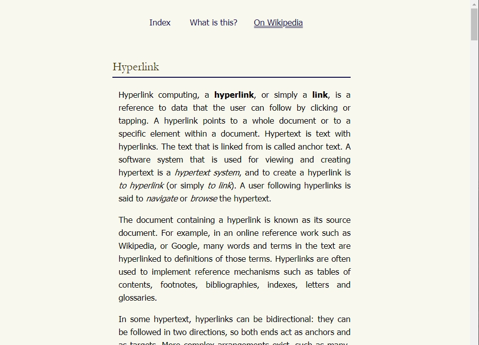
This is an encyclopedia based on Wikipedia’s database, that strips away most links and almost all visual clutter to provide a more book-like reading experience with fewer distractions.
What’s taken away is all the design elements that your brain would have to filter out to read the text of the article. It seems as though overburdening this mental process causes the reader to start scanning the text instead of reading it, which is experienced as an inability to pay focus.
The difference is pretty stark:
I think this generalizes beyond Wikipedia. When you pair this idea with The Internet Is Rotting, an article I linked to in Musings #4 about old links not working anymore, maybe abundant hyperlinks isn’t the best way. Although I just included two hyperlinks is the last sentence, only half ironically, so maybe that isn’t the perfect solution.
You.com - A Better Search Engine
Speaking of hyperlinks and finding oases in the modern internet, You.com is a new search engine that launched last week. I’ve been using the beta for the last couple months and it has completely changed my internet experience.
You rethinks how search results are displayed, with different sections of horizontal carousels with results from sources such as web, Reddit, GitHub, Twitter, Medium, StackOverflow, individual news sites, Yelp, and many more that change based on the intent of the search.
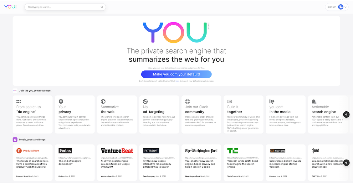
For years, I have languished the deteriorating relevance of search results of the major search engines that are increasingly populated with ads and search-optimized, click-bait “content”. You is an refreshing alternative to that world.
So much of the internet experience is about search. In fact, 68% of trackable website traffic comes from either organic (40%) or paid (28%) search. That more than a quarter of web traffic comes from advertisements on the search results page says to me that there are too many ads and the search experience is not optimal.
The founder of You, Richard Socher, agrees:
Search today is overrun by ads. Advertisements and a flood of search-engine-optimized pages (second-order effects of the ad overload) make parsing for relevant information difficult and time-consuming.
What is also interesting (same source) is that nearly 65% of searches are “zero-click,” which means they end without that traffic going to another website. Nice to know it is not just me who uses google as a spell check.
But what this actually means is that the search engines are keeping more of the traffic to themselves:
Whether searches are quick facts or answers to questions — like the score of last night’s ballgame or the temperature outside — this rising trend of zero-click searches is worrisome as the entire economy moves online. With one gatekeeper having two-thirds of search traffic within its own ecosystem, I predict the trend of zero-click searches will only increase, and ads will continue to proliferate in the search results.
Visualizations
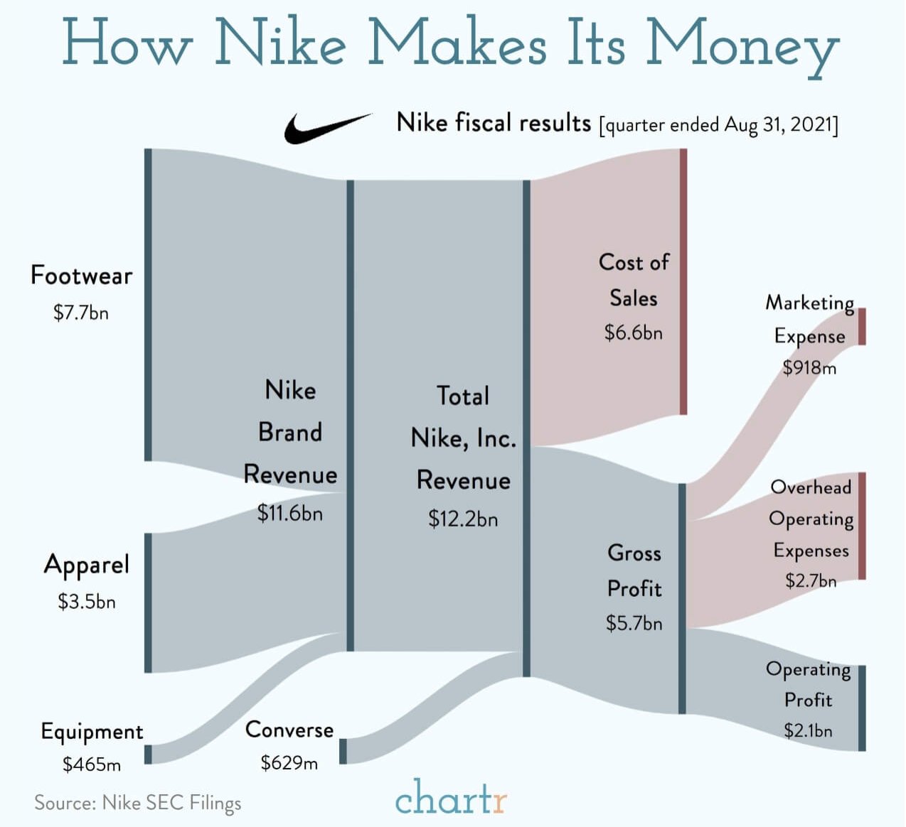
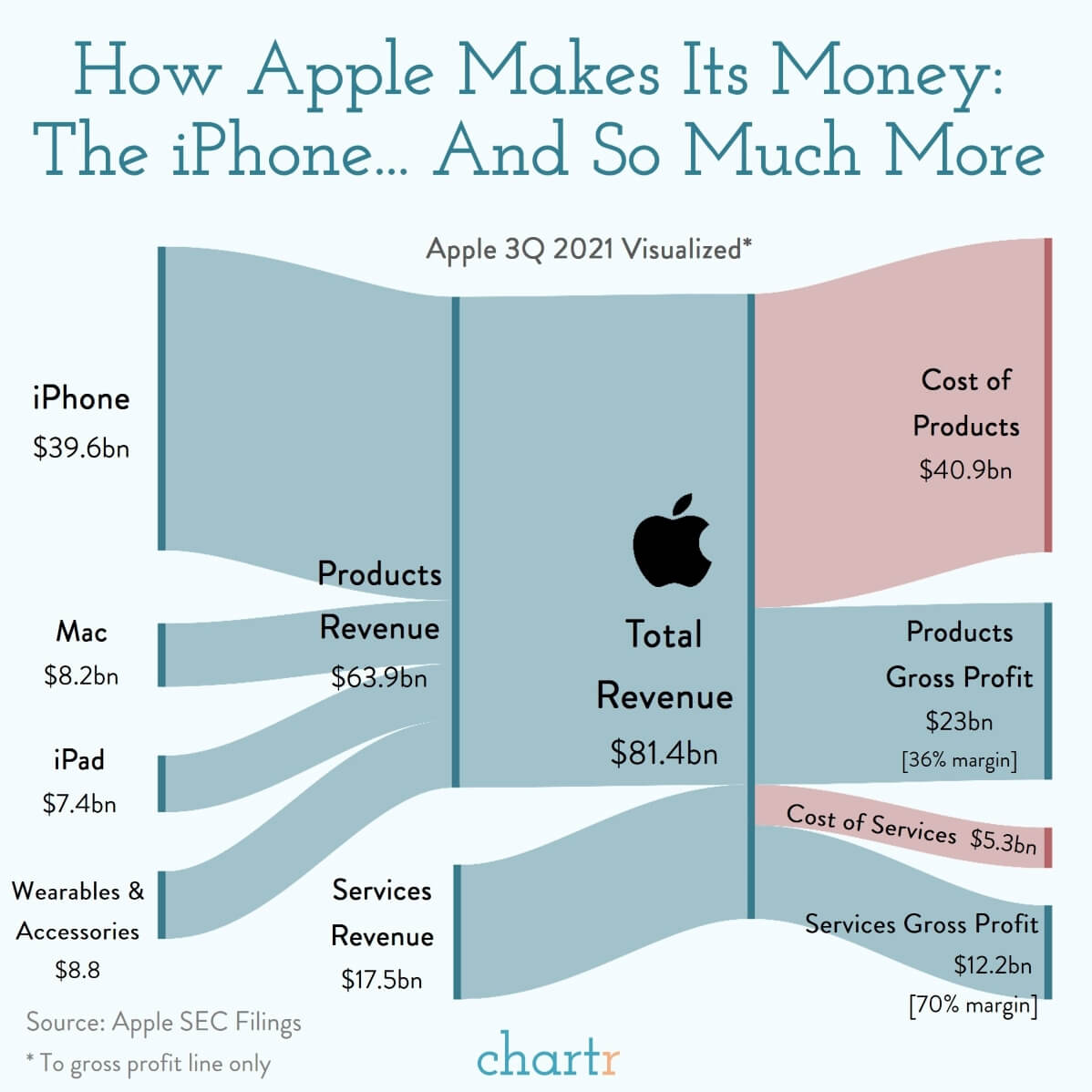
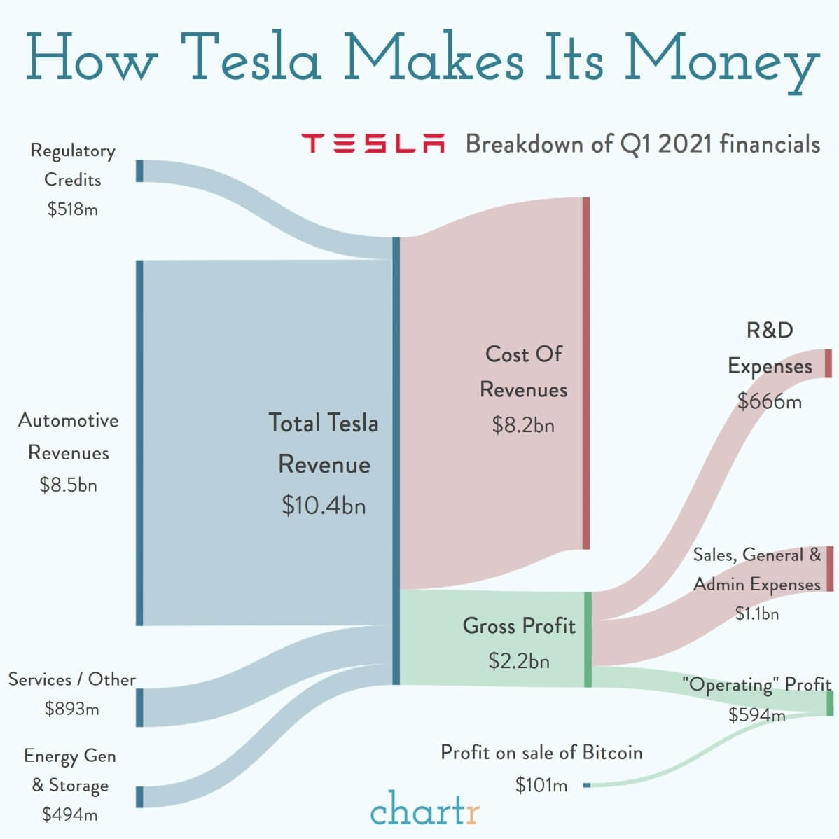
Also on the topic of good design, these visualizations of income statements from chartr are wonderful.
Curveballs
I capture highlights from all the things I read. A few noteworthy ones of late:
-
“If the IPO process is like a debutante ball, the top investment banks are akin to a finishing school. They help gussy up companies, teach them proper manners like how to do GAAP accounting, and bring them around to call on prospective investors and eventually debut to society.” - Narrative Distillation (Kevin Kwok)
-
“The thing that people scoff at – these are just stupid jpegs! – is the same thing that makes them so rife for narrative building. They’re largely empty vessels into which the community of owners and supporters can pour stories that turn into a narrative. Studying what makes certain NFTs valuable is instructive for anyone trying to build a narrative today.” - Story Time (Packy McCormick)
-
“Loyalty is something you need for things you don’t love enough. When you love enough, loyalty isn’t even a question.” - The Mountain Shadow (Gregory David Roberts)
Lastly: Satellites
Very cool:
The satellites of earth… pic.twitter.com/4pXVJajxvt
— Brian Roemmele (@BrianRoemmele) October 4, 2021
Related: Planet is one of the most interesting companies I’ve come across lately - it has 200+ satellites in orbit taking daily images of every place on earth with many fascinating use cases. Its CEO recently did a great podcast on Invest Like The Best that is worth a listen.