CohortCharts.com
Today, I launched CohortCharts.com, a completely free website with the largest collection of publicly available customer cohort charts.
Why? Because cohort charts are the single most useful way to understand a company’s business. They are the foundation for modeling customer processes, understanding growth dynamics, calculating customer economics, and determining value of the company.
Sadly, only a handful of companies publish these charts at all, and unfortunately they usually only appear once in an IPO filing, never to be seen again.
Over the years, I have gathered every cohort chart I could find, cataloged them, and used them as source for deeper analysis. For example, these charts enabled rich and informative analyses that I have published of Chewy (plus a followup), Unity, and BackBlaze. This way of thinking is also foundational to the idea that Sales & Marketing is Capex (one of the most popular essays I’ve written).
Now, all these charts are available at CohortCharts.com. There are 91 so far, and it is illuminating to see them all next to each other in one place.

Some interesting notes and meta-analysis as I was putting this all together:
Cohort charts rose in popularity from 2014-2021
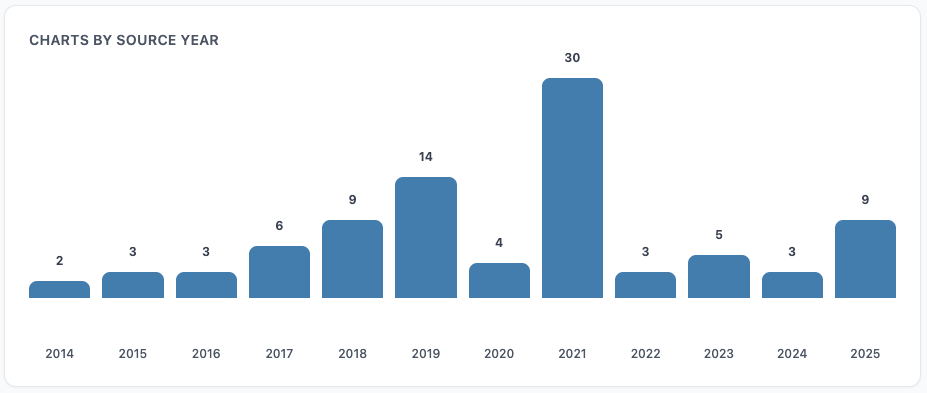
The popularity of disclosing cohort charts started around 2014, and steadily increased with a peak in 2021. There is some correlation with IPO filings, the main source of these charts, for which 2021 was an extremely active year.
But this timeline generally makes sense, with the rise of SaaS as a business model and e-commerce companies during this time frame, along with a corresponding increased awareness of the merits of cohort analysis from investors and companies alike.
Still in early innings of adoption
There is along way to go, though. While every subscription or repeat-purchase business should track this data internally and be using it to guide its business and financial decisions, many still aren’t. Even fewer are pro-actively disclosing cohort-based analysis to investors.
On the other side of the table, investors should be performing cohort analysis as a way to understand companies and how they are evolving, especially in PE/VC where this data can be requested. This is increasingly the case - for example with the current (and appropriate) fixation on (the often poor) retention of many recent consumer AI apps - yet many investors are overlooking the insights these charts unlock.
An illustrative recent example of how overlooked these charts are is the recent Figma IPO where one of the best cohort charts ever was included in the S-1 filing, yet if you peruse analyst initiating coverage reports, IPO teardowns, etc., you’ll find only a small fraction even mention it.
The first published cohort chart belongs to…
…Trupanion, with a small chart in its S-1 filing from February 2014.
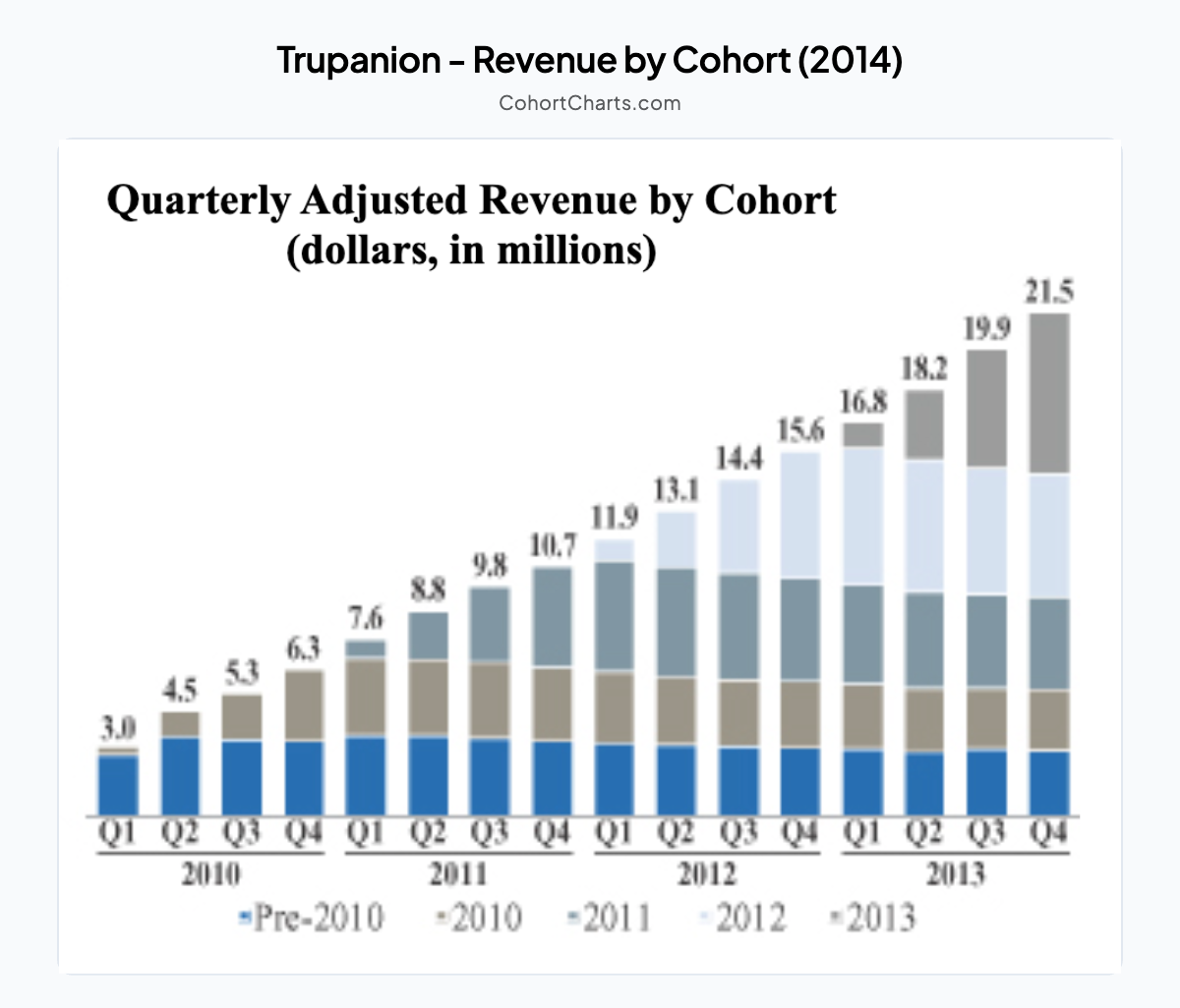
I’m sure many companies had done this analysis internally before this, but as far as I can tell this is the first public one. Know of an earlier one? Let me know!
Where are most cohort charts found?
IPO filings are by far the most common place these charts are disclosed. It makes sense - this is when the most disclosure about a company’s business is required, and cohort charts are a highly effective way to convey a lot of information in a single chart.
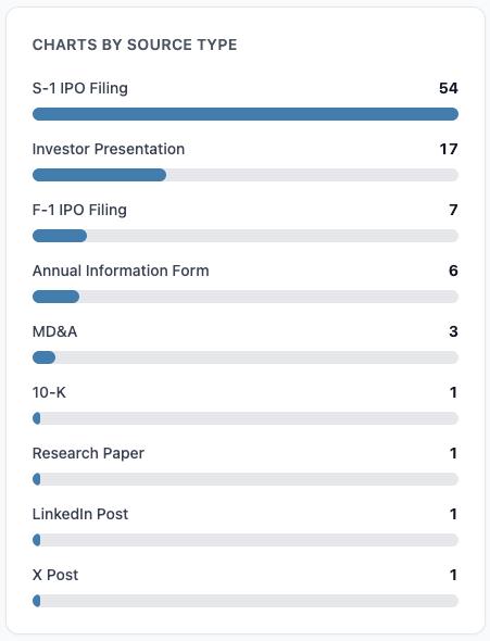
Unfortunately, most companies never report a cohort chart again after they go public. I suspect because they don’t need to, and most companies want to disclose as little as possible. Once a company starts reporting something regularly, it is a red flag if they ever stop.
To me, this is a missed opportunity. Companies with genuinely good economics can garner a lower cost of capital through continued disclosure of this type of information.
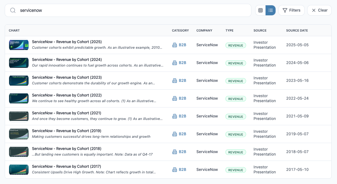
ServiceNow understands this, as it has included a cohort chart in every investor presentation for many years now.
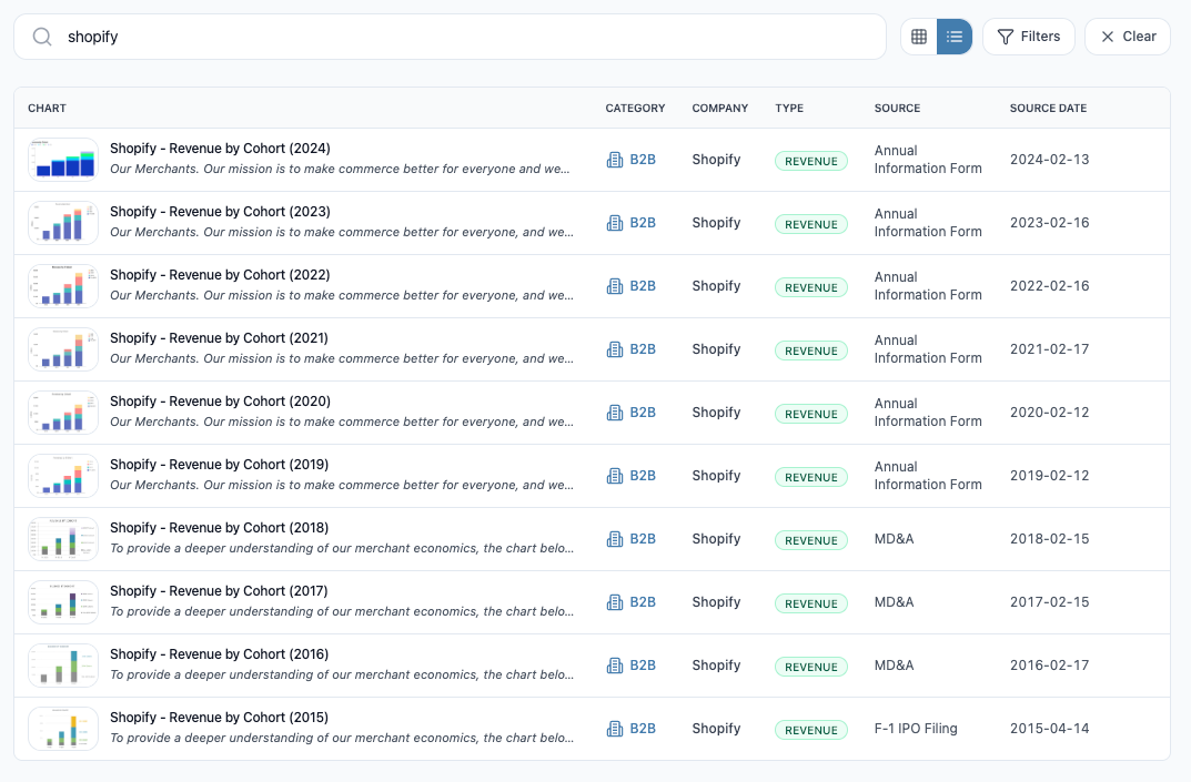
Shopify also deserves a shoutout as it disclosed a cohort chart in its IPO filing, and has continued to update and include it every year in its annual information form.
The company with the best cohort disclosure: zooplus SE
zooplus, a German pet supply e-commerce company, easily wins the award for best disclosure with a cohort chart included in almost every investor presentation from 2014 until 2021 when it was acquired.
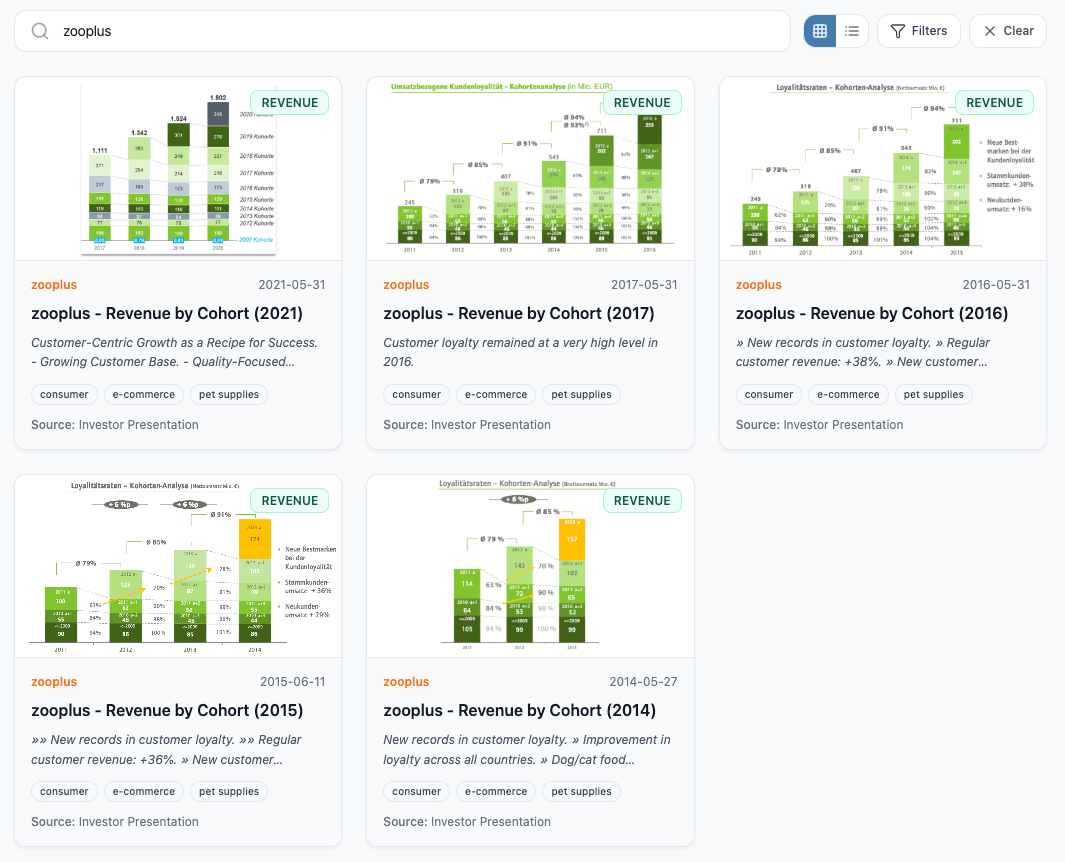
Whereas many companies omit labels, remove the y-axis, or truncate cohorts, zooplus stands out for publishing its charts with labels and annotations for every datapoint, helping investors understand its business in a more complete way and enabling further analysis.
In 2021, zooplus was acquired by private equity for $4.3 billion after a bidding war. It is not surprising that a company with this level of understanding and focus on its cohort analytics was very successful.
Cohort charts are for many types of businesses
‘B2B’ (mostly SaaS) are the most common type of businesses that have disclosed cohort charts. More on this below.

That said, B2C businesses like e-commerce are an excellent domain for cohort charts and the insights they unlock. Payments, marketplaces, and platforms also benefit greatly from this approach where the strength of the business is best defined by its ability to acquire, retain, and grow customer cohorts.

Who has the best cohort dynamics?
It is difficult to pick just one company, but the following are a sampling of standouts - each with cohort revenue growing over time, meaning that revenue growth from retained customers in the cohort is more than offsetting any churn.
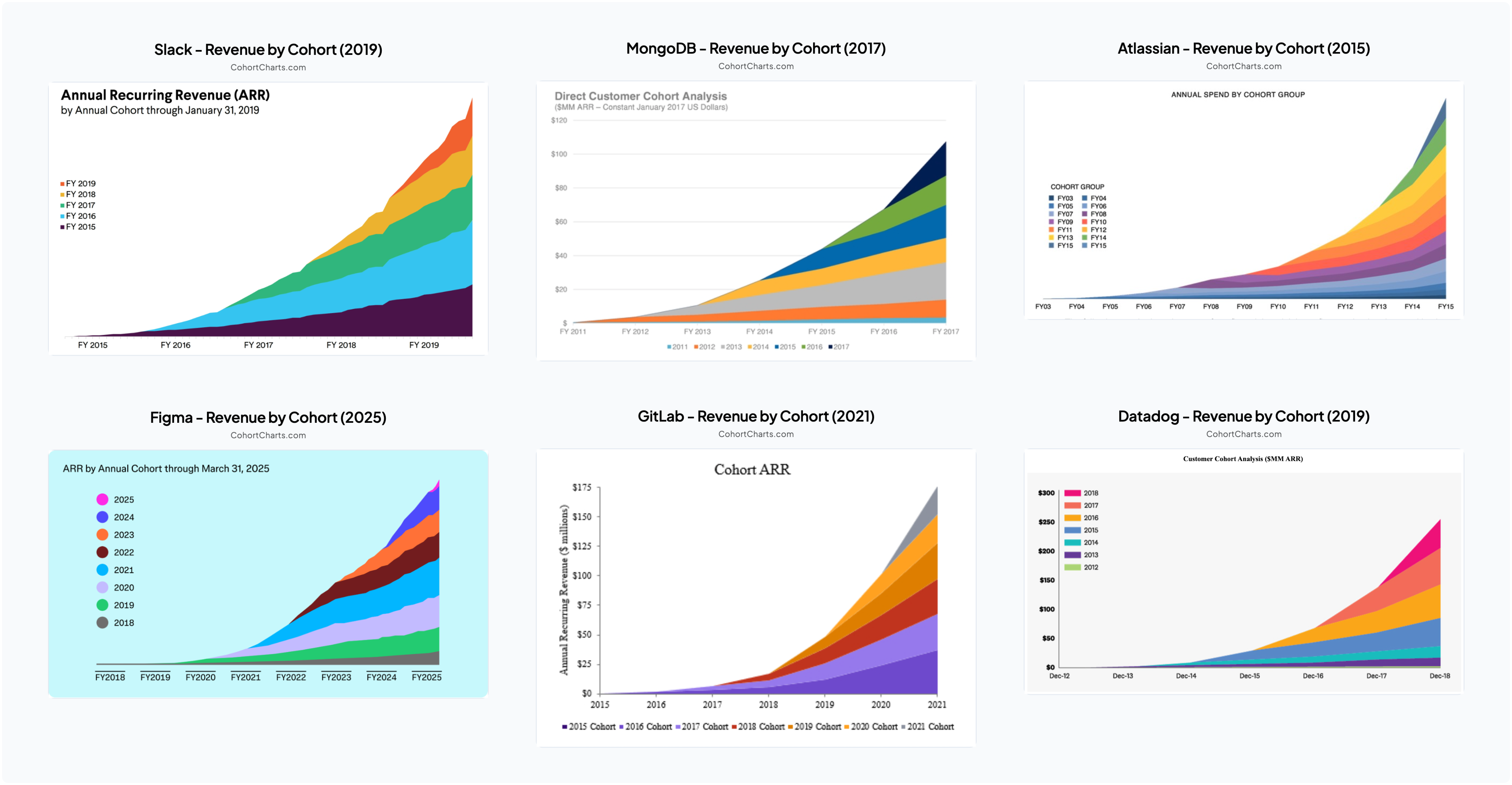
The best thing about businesses like this with net revenue retention above 100% is that significant revenue growth is already baked in - existing customers drive growth without needing new acquisition. Imagine waking up on January 1 already knowing you’ll grow revenue 30% this year just from your existing customer base, and you can flex sales and marketing spend to layer on even more growth through new customer acquisition.
The above six companies (Slack, MongoDB, Atlassian, Figma, GitLab, Datadog) all have something else in common: they’re B2B SaaS businesses.
B2B vs B2C
When you filter on B2B versus B2C companies in the database, the trend is striking: B2B companies (most of which are SaaS) often show growing cohort revenue over time, while B2C companies typically have declining cohort revenue.
B2B SaaS businesses naturally have higher ceilings for cohort charts because they have multiple dimensions for revenue expansion from existing customers (more seats, expanded usage, higher prices). In contrast, consumer products typically serve individual customers who buy discrete units, limiting revenue expansion primarily to price increases. Additionally, businesses make long-term investments in software that becomes embedded in their operations, creating switching costs and stickiness, whereas consumer products tend to be more discretionary with lower barriers to switching.
There is also a strong selection bias here as companies with great cohort dynamics are more likely to disclose these charts (and be going public in the first place). Many, if not most, B2B SaaS businesses have net revenue retention < 100%.
Regardless of how good some of these cohort charts look, what really matters for every company is customer economics. A company with seemingly low retention could have incredible economics if CAC is low enough. The most important question is whether the customers the company is acquiring are actually profitable with positive LTV. Beyond that, the key consideration is how scalable and repeatable its growth engine is.
Cohort charts are just the starting point
Customer cohort charts offer an incredible view into a company’s business. They are information-rich while conveying the big picture in a single glance. If I only had one chart to look at to understand a company, it would be a customer cohort chart.
But cohort charts are just the starting point - the underlying data of these charts are the foundation for more in-depth customer-based analysis and insights. Customer behaviors of acquisition, retention, and spend can be modeled and used as the basis for financial projections. Customer economics can be calculated for every cohort to understand profitability, identify trends, and drive decisions on investing in sales & marketing. And valuation of the company can be determined based on the value of its existing and projected customer base.
I hope CohortCharts.com becomes a valuable resource for investors, founders, and anyone interested in understanding how businesses really work. Whether you’re analyzing potential investments, benchmarking your own company’s performance, or simply curious about customer dynamics across different business models, these charts offer a unique window into the growth of modern companies. If you have a company or firm interested in diving deeper into customer analytics, I’d love to hear from you - I’m building something related to these ideas. Feel free to get in touch!
I’ll continue adding new charts as they become available, and I welcome suggestions for companies I may have missed. Check out the database at CohortCharts.com, and let me know what insights you discover.
Disclaimer: This post is strictly for informational purposes only and should not be construed as investment advice or a recommendation to buy or sell any security. The views expressed herein are the author's alone and do not represent views of any organization or employer the author is currently or was previously associated with. Click here for full disclaimer.